Archive for the ‘Inflation’ Category
Phily Fed Survey: More of the Same
The quarterly survey of forecasters, produced by the Philadelphia FED, is one of my regular touchstones for where the economy is headed. One caveat — in “steady” times, they tend to be pretty accurate. They miss black swan events, but so do everyone.
That said, they are look at annualized GDP growth of about 3% in the coming quarter and about 2.6% in the following quarter. Job growth will decline into 2019, adding about 195,000 jobs per month this year, declining to about 165,000 next year. However, unemployment will remain pretty much where it is. Inflation continues to be a non-event. These numbers pretty much make sense, if you consider there is a pretty strong tail wind. We’ve been on a positive trend since about 2010, and in the absense of systemic shocks to the system, why worry?
I’ve noted in the past that this group of forecasters tend to be fairly… ahhh, I hate to use the word lazy, but what the heck. They mostly work for banks and such, and so have a bit of a bias in favor of good times ahead. That’s one of the reasons they tend to miss negative signals. I’ve noted here in past posts that the yield curve is approaching a dangerous inverted shape (for the uninitiated, this isn’t just reading tea leaves — it tells us a lot about the expectations of borrowers and lenders). The trade war only gets worse, and we’re seeing increasing disruptions in agriculture and manufacturing here in the U.S. as a result. I’m not trying to be Chicken Little, but this is certainly influencing my thinking.
Share this:

Inflation outpacing wages. Fed expectations?
Those of us who lived through the 1970’s may think that 3% or 4% inflation is childsplay, but the FED doesn’t necessarily look at it that way. Indeed, they’re an “inflation conservative” bunch, and don’t take too kindly to the CPI heading northward.
An article this morning in CNN Money offers two painful scenarios. First, inflation is nudging up, in no small part from housing costs and health care costs. Add to that the impending impact of the coming Trade War, and the news isn’t very good.
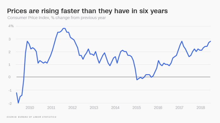
Graphic courtesy money.cnn.com
Second – and we’ve been predicting this – consumer prices are rising higher than wages. The difference isn’t very big at the median, only 0.2 percentage points, but given the disparate increases in incomes in America of late, and the disparate consumptions patterns, this means that the burdens of cost inflation are being disproportionately felt by working families.
More to come….
Share this:

Commercial property prices
First, a happy 4th of July to all of our U.S. readers! I’ve spent the day catching up on reading, writing, and napping. I hope you’ve all done the same.
Part of my reading was a recent piece by Calvin Schnure for the members at NAREIT titled Commercial Property Prices Continue Steady Gains. It’s an interesting read, and factually correct. However, Mr. Schnure and I might arrive at somewhat different conclusions. Case in point is illustrated by the graphic below, taken from his article:

Now, if you are running a REIT and want to convince potential investors that the world is rosy, then this is a very pretty graphic. On the other hand, if you are a real estate analyst (ahem…. please hold your applause) you have to wonder what the heck is going on here. I’m particularly concerned with multi-family, which has increased in value on the order of about 60% since the previous peak (December, 2007) but is up by something close to 160% since the trough of 8 years ago. Yeah. That’s a huge run-up. Couple that with the observations (anecdotal, at present) that multi-family vacancies are on the rise nationwide, and particularly, surprisingly, in formerly hot markets like Seattle (just to name names).
I’m not preaching a long-term or even intermediate term demise for multi-family. Far from it, in the long term, these are still worth considering. However, in the short-term, these annualized gains may not be sustainable.
By the way, there’s a lot more in the NAREIT article, and it’s worth reading in its entirety.
Watch this space. We’ll keep you posted.
Share this:

And yet more on housing
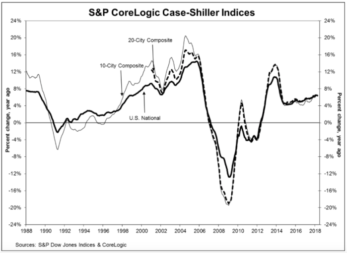
Twice burned, you know? I think we should all be a bit gun-shy about rapidly increasing house prices. Are we looking for a bubble or a peak?
The S&P CoreLogic Case-Shiller U.S. National Home Price NSA Index, reported a 6.4% annual gain in April, slightly down from an annualized rate of 6.5% in March. While they produce a few other indices, all of them basically report the same thing. Oh, by the way, my home city of Seattle leads the pack with an annualized rate north of 13%.
Glancing at the graphic, below, the slope of the current pricing graph looks suspiciously like what we saw during the bubble run-up. As I’ve noted here previously, house prices increasing at a rate higher than 2 points over inflation is emblematic of a bubble. That would suggest a nationwide rate somewhere around 4% – 5% right now. You do the math.
Share this:

Deconstructing house prices
I stumbled on a very interesting graphic on the inter-web the other day. I can’t provide the citation just yet — it was posted anonymously on a data visualization web site. Nonetheless, I’ve done a bit of research to semi-validate these numbers, and even if they’re off a bit, it’s a very useful graphic.
First, it tells us that since 2002, the median price of a new home in America has approximately doubled, from $175,000 to about $350,000 (depending on exactly which metrics you use, this is about right). That’s an inflation rate of about 100%, more or less, in 15 years (end of 2002 to end of 2017). In a paper I presented at the American Real Estate Society annual meetings about 10 years ago, I noted that post-WW2 data indicated that house prices/values should be expected to grow annually at a rate of about 2 percent points above the inflation rate. I checked, and the actual inflation rate over that period measured by the CPI totaled 36%, more or less. That averages about 2.1% per year, compounded. The doubling of house prices in 15 years equates to an inflation rate of about 4.7%. So…. 4.7 minus 2.1 = 2.6. Thus, by my estimation based on historical averages, house prices have been growing about 0.6% per year faster than they should have since 2002.
You might argue that some of that was the last few years of the housing bubble, but that sponge got squeezed out in the post-bubble collapse. Nope, folks, what we’re seeing is the echo bubble. You might also argue that 0.6% doesn’t sound like much, but here’s what it amounts to over time. If house prices had actually grown at the rate suggested by previous post-WW2 data, then prices would only have gone up by about 170% over that time period. That means that a $175,000 house from 2002 should today be selling for about $295,000. The difference (350,000 minus 295,000) of about 17% is the measure of the echo bubble — it’s the degree to which houses are currently overpriced.
Ahem…. that’s NOT the point of this story. That’s just the introduction. The more important story comes from deconstructing house prices into various tranches. This graphic I found does a wonderful job of that:
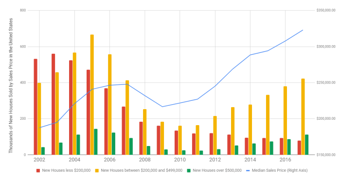
Here’s my point in a nutshell. Note that in 2002, the plurality of homes built were in the “less than $200,000” category. Today, that’s the smallest category (the one in red). Conversely, we’re building about twice as many homes in the expensive category (the green bar) as we were in 2002. While all housing starts are down from the peak, compared to the earlier years, we’re now building the bulk of the housing in the two most expensive categories, which is a real shift from 2002.
Why? The market is constantly screaming about the lack of supply for “affordable housing”. Why aren’t builders building to that tranche of the market? The answer is cost. Two very disruptive forces are plaguing the homebuilding industry today. First, the labor and infrastructure for building died off during the recession. We have relatively fewer trained and skilled tradespeople, fewer developed lots (and a shrunken pipeline for development) and more expensive construction lending. Second, the building materials themselves — lumber and steel — are in short supply, have been affected by price increases, and are now faced with tariffs. Builders have no choice but to build more expensive homes to be able to cover the cost of construction.
Are we headed for a new bubble? Back in the dark ages, when I was in graduate school, we were taught that inflation could be caused by either demand-pull (too much money chasing too few goods) or cost-push (increases in commodity costs). Either way you look at it, the cost of owner-occupied housing is going thru the roof (pun intended).
Share this:

Lumber and other simple stuff
Tariffs anyone? Jann Swanson wrote a great piece for Mortgage News Daily last week, titled “NAHB: Lumber Shortages and Prices Hamper Affordability.” In short, the shortages of framing lumber are “now more widespread than any time” since the National Association of Homebuilders began tracking in 1994. About 31% of single-family builders reported shortages of framing lumber in the most recent survey, along with shortages in other building materials. A full 95% of homebuilders reported that prices of these materials were having an adverse impact on housing affordability.
While there are numerous reasons for this, including a shrinkage in the building infrastructure during the several years following the housing melt-down, the NAHB notes that the top five building materials with shortages are on the Trump Administrations list of tariff targets.
Share this:
Boring stuff for a Sunday morning
Any reasonably good education in finance or economics will include a discussion of the term structure of interest rates. It’s important to understand — in normal times, short term rates (both borrowing and lending) are lower than long term rates. However, these rates move all over the map, and at times the relationship can be inverted, as it was back in 2000 (see below).

(By Farcaster – Own work, CC BY-SA 4.0, https://commons.wikimedia.org/w/index.php?curid=66130747)
Why do these rates move around so much, and how can they become inverted (yes, that IS illogical)? Ahhh…. that’s important, but still terribly boring. In general, there are three theories — market expectations, market segmentation, and liquidity preference. Today, I’m interested in the third. In short, in times of trouble, investors (that’s you and me, by the way) want to stay liquid. As such, shorter term rates are artificially pushed down and longer term rates pushed up. The 2011 experience is an example.
So why is this of interest (pun intended) on a boring Sunday morning? Because I made the mistake of reading the news this morning, and happened upon a story from Quentin Fottrell of Marketwatch.com, reprinted in Yahoo Finance (yes, THEY’RE still around!) titled “Americans are hoarding money in their checking accounts — and that could be a problem.” In short, yes it could. To quote, “When times are good, Americans feel confident by keeping little in checking, but when times are difficult consumers store money in checking accounts, effectively pulling back on spending on retail and restaurants.” It’s an excellent article, and I highly recommend it.
Share this:

Quarterly Phily FED survey
Hey, gang! It’s been a while! I’ve been having a darned good winter, how about you? It’s been busy, I’ll say that, hence the gap since my last post.
Anyway, as you may know by now, I’m a regular follower of the Phily Fed’s quarterly survey of economic forecasters. It’s a delightfully simple model — just ask a not-so-random group of economist where they think the economy is headed, then look at both the central tendency (you know, mean, median, mode, that stuff) as well as the dispersion of forecasts (standard deviation, median absolute deviation, stuff like that). The results are not only interesting in and of themselves, but also it’s fascinating to track what the forecasters were saying a quarter ago compared to what they’re saying now (which the FED does).
For example, the forecasters, PREVIOUSLY (end of the year last year) projected that GDP growth for 2018 would be 2.5% (real, annualized), the unemployment rate would be 4.1% on average (and 4.0% at year-end) and that we would add 163,400 folks to the nation’s payrolls on average each month during the year. Today, however, these same forecasters have up’d the ante a bit, forecasting real GDP growth at 2.8% for the year, average unemployment at 4.0% (and ending the year at 3.8%) and adding 175,100 workers to payrolls per month.
Now, don’t get too excited, folks, because as with everything the “devil’s in the details.” A big chunk of the change comes from shifting the shape of the new employment curve. Previously, the forecasters projected a fairly flat payrolls change over the year — not bad, just flat. However, new forecasts project this to be skewed to the early part of the year, and then declining after the summer. Indeed, 2019 is currently projected to be anemic. Early employment numbers has the effect of driving up GDP (people earn and spend money for more months in the year). Note that when we look at the dispersion of GDP growth, there is some great news (very little sentiment for a recession this year) but also some not-so-great news (very little sentiment for growth above 4%).
The Phily FED also surveys for inflation projections, but that’s been flat-lined for years now. Current CPI projections for the year are 2.1%, which is the same as previous projections. Of more specific interest to us at Greenfield, the Phily FED is now reporting forecasts of house price growth for the coming two years, although rather than use their regular panel they are synopsizing several publicly available indices (Case-Shiller, FHFA, CoreLogic, and NAR). In general these indices point to price growth from 4% to 5.2% this year, and slightly lower growth (3.3% to 5.1%) next year.
There’s a bit more to the survey, and if you’d like you’re own copy, just click here.
Share this:
Livingston Survey strengthens
One of my economic “touchstones” is the semi-annual Livingston Survey, begun in 1946 by the famed economist and journalist Joseph A. Livingston. The survey continues today under the auspices of the Philadelphia FED. Twice a year they survey a panel of economic forecasters on the key metrics of unemployment, GDP growth, inflation, T-Bill and Bond rates, and the S&P 500. Not only are their opinions of interest, but also the change in the central tendency of those opinions over time.
For example, six months ago, the panel forecasted that year-end unemployment would be 4.3%, with a slight decline to 4.2% by mid-year, 2018. Now, this forecast has shifted slightly downward, with an expected year-end unemployment rate of 4.1%, mid-year 2018 projected at 4.0%, and year-end 2018 at 3.9%. These are decidedly low numbers, and suggest an econonomy at nearly full steam. (“Frictional” unemployment, which is the lowest level we would normally see, is generally thought to be close to 3%.)
Previously, year-end GDP growth was projected to come in at about 2.5%. That’s now up to 2.9%, settling back to about 2.5% by mid-year 2018. Projections of inflation are also solid, with CPI ending the year at about 2.1% and PPI (producer price index) at about 3.0%. Both of these estimates are slightly lower than previously forecasted. Intriguingly, CPI is forecasted to stay about the same in the coming year, while PPI should decline to about 2.0% by the end of the year next year.
The cost of debt is projected to increase in 2018, albeit at modest rates (and lower than previously projected). Previously, the 10-year bond rate was forecasted to end the year at about 2.75%, but now should end the year at about 2.45%, according to the panel. Rates should rise in 2018, but more slowly than previously projected, ending 2018 around 3.0%
Finally, the June survey projected that the S&P 500 would end the year at 2470, but now the panelists think the market will end the year at 2644. (I note that the S&P sits at 2691 as I write this.) The S&P is projected to end 2018 at 2805, or about 6% higher for the year.
The full survey also contains data on a variety of other topics (auto sales, corporate profits, average weekly earnings, etc.). You can subscribe by visiting the Phily Fed at www.philadelphiafed.org/notifications.
Share this:
So, folks, where are we going to live?
Much has been said recently about housing starts being back up to where they were before the recession. If this is the case, then why does Seattle, for example, have a 0.9 month supply of homes for sale? As usual, the details are much more complicated than the headlines.
Prior to the “meltdown” (let’s say, 2004 – 2007), housing starts in the U.S. averaged about 1.865 million units per year. Now, few analysts disagree that this was too many, but figuring out the right number is harder than one might think. In 2008, the number dipped down to about 905,000, and hit a low of 583,000 in 2009. Since then, the annual starts have trended up. However, in 2016, we still were only at 1.207 million. Of that, only 751,000 were single family units, compared to an average of 1.4 million single family homes per year in the 2004-2007 period. Hence, nationally, we’re building about half as many homes as we were 10 years ago.
From 2004-2007, we started 7.462 million dwelling units in America, but in the past four years we’ve only started a total of about 4.432 million (all varieties). That’s a shrinkage of about 3 million new homes, and most of that shrinkage is in the single family category.
One might posit that the decline in home ownership rates should have freed up some demand, and some of that’s true. The home ownership rate in America peaked at 69% during the run-up to the recession, and dropped steadily after the melt-down, to a low of 62.9% in the 2nd quarter 2016. As of the end of the 3rd quarter this year, it sits at 63.9%, or about 5 points below the peak of a decade ago.
There are about 76.146 million owner-occupied housing units in the U.S. today. A five-percent swing in this number is a little over 3.5 million houses. In short, we’ve now “absorbed” the decline in starts, and structurally we’re more-or-less “over” the recession, and we’re simply not building enough new homes to meet the demand.
Several consequences came out of the melt-down. First, developing land takes quite a few years — five or more in the “hot” areas like Seattle, where land has to go thru a permitting and entitlement phase long before a house can be built. All of this requires land planners, both in the private sector and downtown at the county or city hall. Many of these folks lost their jobs during the 2008-09 period, and indeed some county and city planning offices were eviscerated. New home development frequently requires a significant outlay in public infrastructure, including schools, roads, and utilities. Worse than that, many construction trades were gutted, with no replacements available. Financing for acquisition, development, and construction is now problematic (although, arguably, it was too liberal pre-recession).
As such, it’s a sellers market for homes, and in hot markets, buyers compete by bidding up prices beyond reasonable levels. Some pundits are nervous, and with good reason.
(Thanks to the U.S. Census Bureau for the October 31 data.)