Posts Tagged ‘Inflation’
Deconstructing house prices
I stumbled on a very interesting graphic on the inter-web the other day. I can’t provide the citation just yet — it was posted anonymously on a data visualization web site. Nonetheless, I’ve done a bit of research to semi-validate these numbers, and even if they’re off a bit, it’s a very useful graphic.
First, it tells us that since 2002, the median price of a new home in America has approximately doubled, from $175,000 to about $350,000 (depending on exactly which metrics you use, this is about right). That’s an inflation rate of about 100%, more or less, in 15 years (end of 2002 to end of 2017). In a paper I presented at the American Real Estate Society annual meetings about 10 years ago, I noted that post-WW2 data indicated that house prices/values should be expected to grow annually at a rate of about 2 percent points above the inflation rate. I checked, and the actual inflation rate over that period measured by the CPI totaled 36%, more or less. That averages about 2.1% per year, compounded. The doubling of house prices in 15 years equates to an inflation rate of about 4.7%. So…. 4.7 minus 2.1 = 2.6. Thus, by my estimation based on historical averages, house prices have been growing about 0.6% per year faster than they should have since 2002.
You might argue that some of that was the last few years of the housing bubble, but that sponge got squeezed out in the post-bubble collapse. Nope, folks, what we’re seeing is the echo bubble. You might also argue that 0.6% doesn’t sound like much, but here’s what it amounts to over time. If house prices had actually grown at the rate suggested by previous post-WW2 data, then prices would only have gone up by about 170% over that time period. That means that a $175,000 house from 2002 should today be selling for about $295,000. The difference (350,000 minus 295,000) of about 17% is the measure of the echo bubble — it’s the degree to which houses are currently overpriced.
Ahem…. that’s NOT the point of this story. That’s just the introduction. The more important story comes from deconstructing house prices into various tranches. This graphic I found does a wonderful job of that:
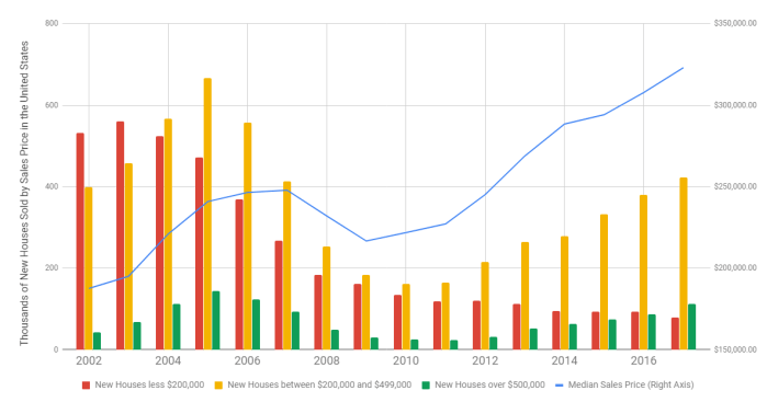
Here’s my point in a nutshell. Note that in 2002, the plurality of homes built were in the “less than $200,000” category. Today, that’s the smallest category (the one in red). Conversely, we’re building about twice as many homes in the expensive category (the green bar) as we were in 2002. While all housing starts are down from the peak, compared to the earlier years, we’re now building the bulk of the housing in the two most expensive categories, which is a real shift from 2002.
Why? The market is constantly screaming about the lack of supply for “affordable housing”. Why aren’t builders building to that tranche of the market? The answer is cost. Two very disruptive forces are plaguing the homebuilding industry today. First, the labor and infrastructure for building died off during the recession. We have relatively fewer trained and skilled tradespeople, fewer developed lots (and a shrunken pipeline for development) and more expensive construction lending. Second, the building materials themselves — lumber and steel — are in short supply, have been affected by price increases, and are now faced with tariffs. Builders have no choice but to build more expensive homes to be able to cover the cost of construction.
Are we headed for a new bubble? Back in the dark ages, when I was in graduate school, we were taught that inflation could be caused by either demand-pull (too much money chasing too few goods) or cost-push (increases in commodity costs). Either way you look at it, the cost of owner-occupied housing is going thru the roof (pun intended).
Share this:

Livingston Survey strengthens
One of my economic “touchstones” is the semi-annual Livingston Survey, begun in 1946 by the famed economist and journalist Joseph A. Livingston. The survey continues today under the auspices of the Philadelphia FED. Twice a year they survey a panel of economic forecasters on the key metrics of unemployment, GDP growth, inflation, T-Bill and Bond rates, and the S&P 500. Not only are their opinions of interest, but also the change in the central tendency of those opinions over time.
For example, six months ago, the panel forecasted that year-end unemployment would be 4.3%, with a slight decline to 4.2% by mid-year, 2018. Now, this forecast has shifted slightly downward, with an expected year-end unemployment rate of 4.1%, mid-year 2018 projected at 4.0%, and year-end 2018 at 3.9%. These are decidedly low numbers, and suggest an econonomy at nearly full steam. (“Frictional” unemployment, which is the lowest level we would normally see, is generally thought to be close to 3%.)
Previously, year-end GDP growth was projected to come in at about 2.5%. That’s now up to 2.9%, settling back to about 2.5% by mid-year 2018. Projections of inflation are also solid, with CPI ending the year at about 2.1% and PPI (producer price index) at about 3.0%. Both of these estimates are slightly lower than previously forecasted. Intriguingly, CPI is forecasted to stay about the same in the coming year, while PPI should decline to about 2.0% by the end of the year next year.
The cost of debt is projected to increase in 2018, albeit at modest rates (and lower than previously projected). Previously, the 10-year bond rate was forecasted to end the year at about 2.75%, but now should end the year at about 2.45%, according to the panel. Rates should rise in 2018, but more slowly than previously projected, ending 2018 around 3.0%
Finally, the June survey projected that the S&P 500 would end the year at 2470, but now the panelists think the market will end the year at 2644. (I note that the S&P sits at 2691 as I write this.) The S&P is projected to end 2018 at 2805, or about 6% higher for the year.
The full survey also contains data on a variety of other topics (auto sales, corporate profits, average weekly earnings, etc.). You can subscribe by visiting the Phily Fed at www.philadelphiafed.org/notifications.
Share this:

Livingston Survey
I’ve noted in the past that one of my favorite economic forecasts comes from the Philadelphia FED. The semi-annual Livingston Survey captures the sentiments of 28 leading economic forecasters on key metrics, such as unemployment, GDP growth, and inflation. Year after year, the forecast remains fairly accurate and steady — much to the disappointment of politicians who fail to realize that the worlds largest non-centrally-planned economy changes course fairly slowly.
Of course, 2017 may be a bit of an exception. Indeed, so was 2009. The forecast can’t take into account shocks to the system (such as the recent economic melt-down) nor can it handle significant policy shifts from D.C. I have some “gut” feelings that differ a bit from the Livingston folks, and I’ll note those at the end.
Now, on to the details. GDP growth for the second half of 2016 was a bit better than had been previously forecast, coming in at about 2.7% rather than the previously forecast 2.4%. Looking forward, the forecasters project a 2.2% annualized growth in the economy during the first half of the coming year, rising slightly to 2.4% in the second half of 2017.
Ironically, unemployment appears to be coming in slightly higher than forecasted, about 4.9% rather than the previously projected 4.7%. Of course, neither of these numbers is anything to complain about. Forecasters look to continued improvement in the unemployment numbers through the coming year, ending up around 4.6% next December.
Inflation measured by the consumer price index (CPI) is right on target at 1.3%. Next year, forecasters are projecting 2.4% (slightly up from previous 2017 forecasts) and the crystal balls (which is all they are this far out) suggest 2.5% in 2018. The yield curve is ending the year a bit steeper than previously projected. Earlier forecasts put the short end (3-month T-Bill) at 0.75% and the long end (10-year) at 2.25%. Currently, they see the year ending at 0.55% and 2.3% respectively. For 2017, the soothsayers forecast a year-end 1.12% at the short end and 2.75% at the high. This is somewhat higher at the high end and lower at the near end than had been projected previously, suggesting an expectation of higher overall interest rates in the future. Finally, forecasters see the stock market rising over the next two years, but at a fairly lackluster rate.
I promised my own bit of forecasting. During the tumultuous months surrounding the recent melt-down, I played a bit of follow-the-leader with this survey, and went on record that the melt-down would be short-lived. Boy was I wrong! As noted, this survey is pretty good when the economic ship is on a steady course, but doesn’t handle rough water very well. For the past several years, we’ve had an unprecedented period of economic growth, by all metrics (GDP, stock prices, unemployment, and inflation). Just from a pure market-cycle perspective, we may be overdue for some unpleasantries. Looking at the political horizon, I’ve already noted that politicians are generally disappointed that the economy doesn’t move as quickly as they wish or even in the desired directly. That said, we have a Congress that is frothing to trim the Federal budget, and will probably opt to do so in the transfer payments arena (welfare, health care subsidies, etc.). They’ll hope to balance this with tax cuts. However, tax cuts fall slowly, and on one sector of the economy, while entitlement cuts (and any budget cuts, for that matter) happen quickly and are usually borne by a different segment of the economy. I think I’ll be watching GDP reports fairly closely for the next couple of years. I would note what happened in the years leading up to the 1982 recession — not withstanding inflation (driving nominal interest rates), the economy looked OK in 1981, and the metrics were generally pointed in the right direction. (For a good visual representation, I’d refer you to the August, 1981, report to Congress of the Council of Economic Advisors, a copy of which you can view on the St. Louis FED’s website by clicking here.)
All in all, we’ve been focused on politics for the past several months, and now we’re going to find if those political decisions have actual economic repercussions. Stay tuned!
Share this:
December’s Livingston Survey
The late columnist Joseph A Livingston started surveying economists about their forecasts back in 1946. It’s the oldest continuing survey of its kind, and is continued twice a year under the auspices of the Philadelphia Federal Reserve Bank. One of the neat things about this semi-annual report is that it compares the current central tendency of projections to the projections which were being made six months ago. In short, we can directly compare how economic forecasts are changing over time.
One of the biggest shifts is in the GDP growth rate for the 2nd half of 2015. Six months ago, economists were projecting that we’d end the year with a modestly healthy 3.1% annual rate of growth. Now, economists are forecasting we’ll end the year at about 2.1% — a fairly significant shift in sentiment. Similar declines in GDP growth are projected for 2016. Check my prior blog post about the 12th District report on the western economy, and particularly the impact a stronger dollar is having on the export market.
The good news — and it’s slight — is an improvement in the projections about unemployment. Six months ago, economists were forecasting we’d end the year with an unemployment rate of 5.1%. This has now been revised downward, ever so slightly, to 4.9%. Also, inflation continues to be dead-on-arrival. From the end of 2014 to the end of 2015, the consumer price index is projected to rise only 0.1%, in line with prior forecasts, and the producer price index is actually projected to fall by 3.2%. Both indices are expected to swell in the coming year, but only slightly. The current CPI forecast for the coming year is 1.8%, and PPI is 0.7%. I’ll leave it up to the reader to pick a reason for this, but can you say “energy costs”?
Six months ago, interest rates were forecasted to rise. Actual increases are somewhat lower than previously forecasted. Six months ago, forecasters predicted we’d end the year with 3-month T-bill rates at 0.59%. In reality, the November 23 auction was at 0.14%, although rates are trending up in December (0.28% as of Monday) in anticipation of Fed rate increases. The current forecast is for 3-month rates to end the year around 0.23%, and for 1-year rates to end around 2.3% (down from the previously forecasted 2.5%). Forecasters currently predict 3-month T-bills will hit 1.12% by the end of 2016, and 10-year notes will end next year around 2.75%.
Finally, forecasters are asked to predict the S&P 500 index for the end of the year as well as the end of next year. Six months ago, the consensus forecast was an S&P level of 2158 for the end of the year, and this has now softened to 2090. (It’s helpful to note that the S&P opened just under 2048 this morning.) Forecasters currently project the S&P will hit about 2185 by the end of next year, which is an anemic growth of 4.5% over the coming 12 months.
If you’d like your own copy, which includes much more detail on these forecasts, you can download it for free here.
Share this:
whew…..
The gap in postings is a good indication of just how busy I’ve been the past several months. Whew….
Anyway, the latest semi-annual Livingston Survey just hit my desk from the Phily FED. Just to remind you, the Phily FED surveys a cross-section of top economic forecasters on four key issues — GDP growth, interest rates, unemployment, and inflation. Ironically, the survey came out before this week’s BEA announcement that GDP grew at an annual rate of 4.1% in the 3rd quarter (following a 2.5% growth in the 2nd quarter).
Nonetheless, the Livingston Survey gives a good snapshot of where professional forecasters think the economy will be over the next couple of years. Forecasters generally see GDP growth ending this year around 2.4%, increasing to an annualized rate of 2.5% early next year, and 2.8% in late 2014.
Interest rate forecasts were also surveyed before the recent FED pronouncements about tapering, although the general sense is that markets have been capturing the “taper” news for a while. Forecasters project t-bill rates to continue below 0.1% into 2014, rising to 0.15% by the end of next year, and 0.75% by the end of 2015. Ten-year bond yields should follow suit, with rates rising above 3% in mid-2014, up to 3.25% by the end of next year. Of course, time will tell on these projections.
Finally, unemployment is projected to dip below 7% after mid-2014, and finish the year around 6.7%. Inflation should hold below 2%, although it is projected to creep up somewhat from the current rates.
The Phily FED produces a series of economic surveys throughout the year. For more information, visit their research department.
Share this:
Quarterly Econ Survey from Phily FED
One of my favorite regular “reads” is the Survey of Professional Forecasters” from the Philadelphia Federal Reserve Bank. The main survey comes out quarterly, with occasional special editions thrown in along the way. The brilliance of the survey is its simplicity — ask a large panel of economic forecasters where they think the economy is going in terms of a handful of key indicators — GDP, unemployment, inflation. Then calculate the median and the range of responses.
The medians are fairly predictable and “sticky” (that is, this quarter’s results look a lot like last quarter’s). However, the interesting stuff is buried in the way the distribution of results change. For example, both the last survey and the current survey find that the largest number of economists think unemployment will average between 7.0% and 7.4% next year (with a median of 7.1%), down somewhat from this year. That’s pretty predictable stuff. However, this year’s distribution is skewed to the low side (a very large number of economists think unemployment will dip this year and end up as low as 7% on average) but next year, the distribution is fairly even, with the bulk of economists forecasting anywhere from 6% to 8%. In short, 2014 is pretty cloudy right now, and that means that hedging your economic bets isn’t a bad idea.
GDP projections are somewhat less rosy. In the previous survey (2nd quarter, 2013), the largest number of economists projected 2013 GDP in the 2% to 3% range, with the median at 2%. Today, that has dropped a full half-percentage point, down to 1.5%. Previously, 2014 was projected at 2.8%, and that has now been downgraded to 2.6%, although as we’ve already established, 2014 is pretty much a guessing game.
Inflation continues to be pretty-much a flat line, with a lot of “1.8%” and “2.0%” on the chart. In short, hardly anyone sees inflation above 2.3% or so in the foreseeable future.
To download the full report, go to http://www.philadelphiafed.org/research-and-data/real-time-center/survey-of-professional-forecasters/2013/survq313.cfm
Share this:
The Livingston Survey — Semi-Good News
Regular readers of this blog will note that I’m enamored with the Philadelphia FED’s surveys of professional economists. They actually do two surveys — one quarterly series, which has a slightly larger survey base, but doesn’t go into as much depth; and the semi-annual Livingston Survey, which has a smaller audience but a lot of detail. For direct access to the current Livingston Survey, click here.
Bottom line? The first half of 2011 isn’t as rosy as economists previously predicted, but they’re still modestly bullish on the second half of the year. Currently, the annualized GDP estimate is an anemic 2.2%, down from an almost-equally boring 2.5% in the December survey. However, GDP growth in the second half of the year is expected to be even stronger than previously thought, with second-half growth forecasted at an annual rate of 3.2%. More significantly, previous estimates of unemployment are being cut. In the last survey, economists collectively projected that year-end 2011 unemployment would stand at 9.2%; today, that projection has been lowered to 8.6%. Of course, these projections were surveyed before the most recent nasty jobs-growth reports, so everyone who uses this data is taking a bit of a “wait and see” prospective.
The nasty news is on the inflation front — prior estimates put the consumer price index rise from 2010 to 2011 at 1.6%; current consensus thinking is 3.1%. While that doesn’t sound like much, the producer price index is even worse — a prior estimate of 1.9% is now being revised to 6.3%. Both indices are expected to settle down in 2012, but we can only hope.
With that in mind, projections of T-Bill and T-Note rates are, not unexpectedly, higher than previously thought. The current 3-month T-Bill rate (as of this morning) is 0.04%. Current thinking is that we will end June in the range of 0.08%, but that by the end of 2012, 3-month bill rates will be up to 1.58%. Ten-year Note rates will follow a similar, but slightly flatter pattern (representing a slight expected flattening in the yield curve). The 10-year composit Note rate as of this morning (according to the Treasury Department) was 3.77%. Economists actually project it will decline a bit by month-end (to 3.25%), then rise slightly by the end of 2012 to 4.5%.
Share this:
Conerly Consulting
Dr. Bill Conerly of Portland, Oregon, produces a wonderful little economic report called the Businenomics Newsletter. You can check it out here. While it is heavily Pacific Northwest focused, he has some great insights into the “big picture” of the U.S. economy as a whole. I highly recommend his research, and (as long as I’m in the promotion game), he’s a great public speaker.
He discusses two key elements of the “end of the recession” right up front — the current consensus forecasts of strong GDP growth for the next two years and the current “bounce-back” in consumer spending (which fell off significantly from mid-08 to mid-09). Unfortunately, capital goods orders are only sluggishly recovering, and state-and-local budget gaps continue to be a drag on the economy.
As for construction, the decline is over, but the bounce-back is sluggish. Residential construction fell from an annual rate of about $550 Billion in the 2007 range to about $250B in 2009, and continues to flat-line there. Private non-residential peaked at about $400B in 2008/09, and has since declined to about $250B (where it’s been hovering for since early 2010). Public non-residential has been on a bit of an up-swing all through the recession, but is still barely above 2007 levels (about $300B). In short, these three sectors taken together have more-or-less flat-lined for the past year and a half or so, and appear to be staying there for the time being.
Anyone who reads the paper or watches the news on TV knows we’re in the midst of a raw materials crisis, with aggregate materials prices (the “crude materials index) up about 25% from its recent mid-2009 low. However, the price index is still well-below early 2008. Conerly suggests that the rise is “hard on some, but will not trigger general inflation.”
The money supply (M-2) continues to grow, and QE2 has apparently not had an inflationary impact, at least from reading the charts. Indeed, prior to QE2, the money supply chart looked like it was ready to flat-line. In total, as Conerly notes, the stock market appears to be happy that the economy is growing again.
Share this:
Paul Krugman’s Column
Frequently I disagree with Prof. Krugman, but I nonetheless enjoy reading what he has to say. His writing is clear and lucid, and he backs up what he has to say with facts rather than simplistic conjecture. Nobel Prize Winners tend to write like that.
Today’s column in the New York Times is no exception, and this happens to be one of those times that I agree with him. Indeed, I think he doesn’t go far enough. I’ll leave the bulk of what he’s said for you to read on your own, but basically he ties global warming (even if you disagree with the theory, you can’t argue with the empirical observations) to floods, famine, and food inflation. Many critics (the Chinese, right-wing-ers, etc.) blame Ben Bernake and QE2 for the crisis. That theory has a real cart-before-the-horse problem. As it happens, global food price inflation became a reality before QE2, not after. Some theorists would also blame China and other developing nations — as their economies grow, their people want and indeed need better calorie counts. City dwellers have less time to prepare complex meals from simple ingredients, thus adding to the food logistics chain.
Krugman draws, I think, a difficult but correct conclusion that global unrest (Egypt, Tunisia) has to be placed in the context of food prices. In developing countries, food makes up a much larger portion of consumption expenditures than it does in the U.S., Japan, or Europe.
Where Krugman stops short, unfortunately, is the more direct implications for the U.S. Authoritarian governments who draw this lesson properly will find themselves caught between a rock and a hard place. On one hand, they will want to pay workers more, either directly (through higher wages) or indirectly (through food subsidies). China, with enormous cash reserves, has the easiest time of this. Indonesia, for example, will face problems. On the other hand, rising wages means either directly raising the costs to the consumers (that’s us and our European friends) or indirectly raising it via currency manipulation (which few countries have the ability to do). Of course, consumers faced with rising prices have the option of decreasing consumption, something which is fairly easy to do when we’re talking about non-essentials. Declining consumption leads to unemployment abroad, which frightens the daylights out of authoritarian regimes.
U.S. consumers have enjoyed rapid increases in consumption with relatively flat-lined prices for the last three decades, due to the juxtaposition of relatively flat commodity prices (food, energy, raw materials), rapid increases in productivity, and global application of the law of comparative advantage. Spikes in commodity prices could change all of this, as we saw in the 1970’s, and THAT may be the most important thing to look at in the economy right now.