Posts Tagged ‘house prices’
And yet more on housing
Twice burned, you know? I think we should all be a bit gun-shy about rapidly increasing house prices. Are we looking for a bubble or a peak?
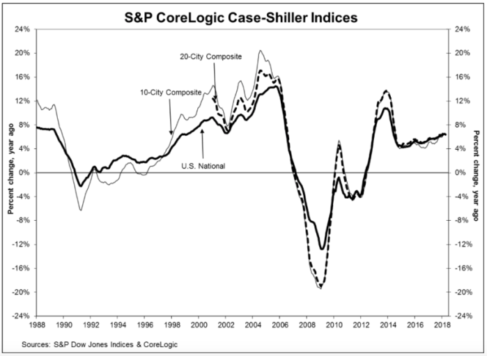
The S&P CoreLogic Case-Shiller U.S. National Home Price NSA Index, reported a 6.4% annual gain in April, slightly down from an annualized rate of 6.5% in March. While they produce a few other indices, all of them basically report the same thing. Oh, by the way, my home city of Seattle leads the pack with an annualized rate north of 13%.
Glancing at the graphic, below, the slope of the current pricing graph looks suspiciously like what we saw during the bubble run-up. As I’ve noted here previously, house prices increasing at a rate higher than 2 points over inflation is emblematic of a bubble. That would suggest a nationwide rate somewhere around 4% – 5% right now. You do the math.
Share this:

Deconstructing house prices
I stumbled on a very interesting graphic on the inter-web the other day. I can’t provide the citation just yet — it was posted anonymously on a data visualization web site. Nonetheless, I’ve done a bit of research to semi-validate these numbers, and even if they’re off a bit, it’s a very useful graphic.
First, it tells us that since 2002, the median price of a new home in America has approximately doubled, from $175,000 to about $350,000 (depending on exactly which metrics you use, this is about right). That’s an inflation rate of about 100%, more or less, in 15 years (end of 2002 to end of 2017). In a paper I presented at the American Real Estate Society annual meetings about 10 years ago, I noted that post-WW2 data indicated that house prices/values should be expected to grow annually at a rate of about 2 percent points above the inflation rate. I checked, and the actual inflation rate over that period measured by the CPI totaled 36%, more or less. That averages about 2.1% per year, compounded. The doubling of house prices in 15 years equates to an inflation rate of about 4.7%. So…. 4.7 minus 2.1 = 2.6. Thus, by my estimation based on historical averages, house prices have been growing about 0.6% per year faster than they should have since 2002.
You might argue that some of that was the last few years of the housing bubble, but that sponge got squeezed out in the post-bubble collapse. Nope, folks, what we’re seeing is the echo bubble. You might also argue that 0.6% doesn’t sound like much, but here’s what it amounts to over time. If house prices had actually grown at the rate suggested by previous post-WW2 data, then prices would only have gone up by about 170% over that time period. That means that a $175,000 house from 2002 should today be selling for about $295,000. The difference (350,000 minus 295,000) of about 17% is the measure of the echo bubble — it’s the degree to which houses are currently overpriced.
Ahem…. that’s NOT the point of this story. That’s just the introduction. The more important story comes from deconstructing house prices into various tranches. This graphic I found does a wonderful job of that:
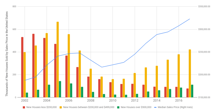
Here’s my point in a nutshell. Note that in 2002, the plurality of homes built were in the “less than $200,000” category. Today, that’s the smallest category (the one in red). Conversely, we’re building about twice as many homes in the expensive category (the green bar) as we were in 2002. While all housing starts are down from the peak, compared to the earlier years, we’re now building the bulk of the housing in the two most expensive categories, which is a real shift from 2002.
Why? The market is constantly screaming about the lack of supply for “affordable housing”. Why aren’t builders building to that tranche of the market? The answer is cost. Two very disruptive forces are plaguing the homebuilding industry today. First, the labor and infrastructure for building died off during the recession. We have relatively fewer trained and skilled tradespeople, fewer developed lots (and a shrunken pipeline for development) and more expensive construction lending. Second, the building materials themselves — lumber and steel — are in short supply, have been affected by price increases, and are now faced with tariffs. Builders have no choice but to build more expensive homes to be able to cover the cost of construction.
Are we headed for a new bubble? Back in the dark ages, when I was in graduate school, we were taught that inflation could be caused by either demand-pull (too much money chasing too few goods) or cost-push (increases in commodity costs). Either way you look at it, the cost of owner-occupied housing is going thru the roof (pun intended).
Share this:

S&P Case Shiller Index
There are two important house price indices in the U.S. — the Federal Housing Finance Authority index (which can be localized down to the SMSA level) and the S&P Case Shiller Index. The latter actually pre-dates the former, and was the source of data for co-founder Robert Shiller (yes, the Nobel Laureate) making his “housing bubble” cries in the wilderness a half-decade ago. If for no other reason, we pay homage to this report, which hit our desks this morning. Additionally, the FHFA index and the C-S index measure house prices somewhat differently, so at a localized level the two indices may say somewhat different things. Here at Greenfield, we often have to cobble together an index for a market that is smaller than an SMSA. Using these two indices in tandem, a researcher is able to discern more subtle issues in a local market. Hence, keeping up with house prices really requires both rather than one or the other.
Bottom line? For the most recent analysis period (October-November, 2011), both their 10-city and 20-city composites showed price declines of 1.3%, and for the second consecutive month, 19 of the 20 cities tracked showed declines. Further, the 10-city and 20-city indices showed annual returns of negative 3.6% and negative 3.7% respectively. Worst city? Atlanta, with a negative 11.8% annual return. The only two cities with positive annual returns were Detroit (+3.8%) and Washington, DC (+0.5%).
 Our own research here at Greenfield suggests that the current “bottom fishing” on house prices will probably sustain until there is some equilibrium in the home ownership rates. One might argue that the stagnation in house prices is indelibly linked to over-supply (the “shadow” inventory in the U.S. equals about a year and a half of sales) and the lack of demand (which is tied to the unemployment rate). Nonetheless, thirty years ago, when interest rates were double what they are today, and the unemployment rate in the U.S. was about the same, home prices were strong and stable.
Why is today different? Three things — first, the home price bubble was caused by the home ownership rate bubble. Until home ownership rates get back to a sustainable level, home prices won’t start behaving. (What is behaving, you might ask? Historically, before the bubble, home prices track very nicely against household income, which means they’re a great inflation hedge.) Second, the recent collapse in home prices has taken the bloom off the rose, so to speak, as American households have lost faith in the “home” as a store-house of value. Finally, the low-down-payment loan was one of the most notable victims of the housing collapse (unfairly, we might add). As such, “starter” home sales are moribund (just look at new home sales for the clue to this one) and if “starter” homes can’t be sold, then “move up” homes can’t be bought.
I hate to be the bearer of bad tidings on a cold, winter day. (Irony — the northwestern U.S., where I live, is the ONLY part of the country not facing unseasonably warm weather this winter.) Unfortunately, housing is just going to limp along for a while.
Share this:

And yet another post about housing
With all the negative news about housing, the market may have a tendency to grasp at any straw that floats along. In today’s news, that straw is a report from the census bureau that home ownership rates — which have been declining steadily for two years, and are now at a 13-year low — seemed to reverse trend in the 3rd quarter and rise by 0.4% to 66.3%.

courtesy U.S. Census Bureau, 11/9/11
Of course, a quick read of the footnotes belies the problem with this pronouncement. First, as you can see, there’s a fair amount of cycling around long-term trends, and that’s probably what this is. Second, on a seasonally adjusted basis (which is really where the truth can be found), the increase was only 0.2%, which is statistically insignificant. Further, on a year-to-year basis, we’re still lower than where we were a year ago, which really underscores the long-term trend. I continue to believe that ownership rates will stabilize somewhere above 64%, but probably pretty close to it. At the current trend, that may take 3 – 5 years.
More importantly, though, an increase in housing demand (and prices) led us out of prior recessions, but housing is continuing to be a drag on the market following this most recent one. Unless and until the housing market doldrums stabilize, solid economic growth will elude us.

courtesy U.S. Census Bureau, 11/9/11