Returns versus volatility
As many of you know, I manage a small hedge fund here at Greenfield called ACCRE, which is invested in a managed portfolio of publicly traded Real Estate Investment Trusts (REITs). My companion blog on that is ACCRE.COM. Returns on ACCRE have been quite good — a dollar invested in ACCRE at its inception back in April, 2017, would be worth $1.40 as of the end of November, while that same dollar invested in an S&P 500 index fund would only be worth $1.17.
That said, both the S&P and ACCRE have had a couple of bad weeks, although ACCRE has not suffered as much as the broader market. I made some comments about that this morning, if you’re interested. You can read those comments here.
Share this:

Meet my new neighbors!
The Puget Sound Business Journal just revealed that Facebook is about to lease 1.3 million square feet in Seattle’s exploding South Lake Union neighborhood. I might add that Expedia is moving from nearby Bellevue into a new campus in the Interbay Neighborhood (to the northwest of the map below). They will occupy the 750,000 SF waterfront site formerly used by Amgen, but will add about 200,000 SF of new space to house up to 9,500 staff. These announcement would be huge for any other top-20 market, but Seattle has it’s 1000 pound gorilla in the form of Amazon, which occupies a stunning 8,100,000 square feet, almost 20% of the downtown office space. By the beginning of the next decade (that’s in about a year, folks), Amazon will employ about 55,000 people in my immediate neighborhood.
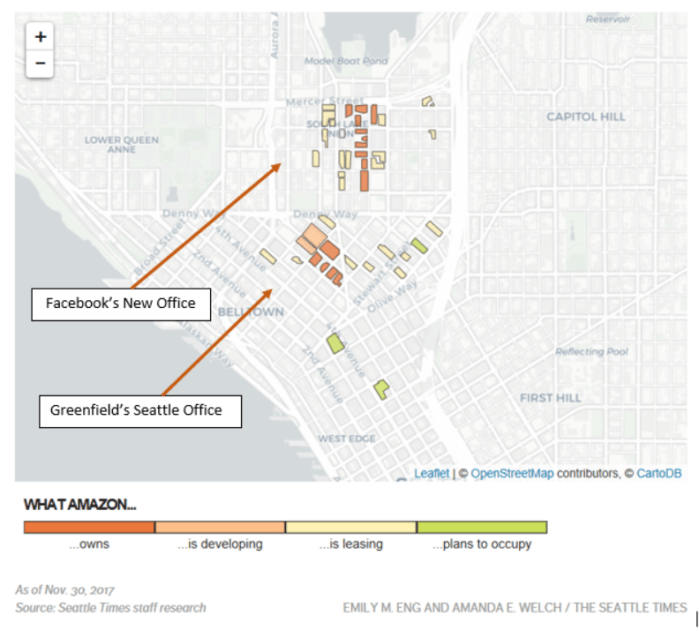
The attached map is courtesy the folks at the Seattle Times. It’s about a year old (I’m too lazy to spend anymore time on this — journalists do great work.) but still more-or-less valid. It is simply astonishing how much space Amazon occupies in one city. For reference, in NYC, the biggest single private sector tenant is Citi, with only 3.7 million SF. As for dominating a percentage of the skyline, Amazon’s 19.2% is also in first place, with the next highest being Nationwide Insurance which occupies 16% of downtown Columbus, OH.
This is even more stunning when you think of how many brand names are in Seattle or the Seattle suburbs — Microsoft, Boeing, Costco, Paccar (they make Peterbilt and Kenworth trucks), the Russell Group, Starbucks, Weyerhaeuser, Holland America, and T-Mobile, to name a few. Add to that the Port of Seattle, which provides thru-put for Washington’s huge agriculture industry, and the associated expeditors, and hopefully you get the point.
I try to keep this blog from being too parochial, but it’s hard not to admit that Seattle is a pretty cool place to do business. However, this comes with some drawbacks. Morning commutes can be brutal — we have some of the worst traffic in America, and it’s getting worse by the day. Rents are going thru the roof. We are geographically constrained and the soil conditions make construction astronomically expensive. Eight or nine months of the year, the weather is retched (but truth be told, it’s the most beautiful place in the world in the summer time). The cost of living here is awful. That said, the Creative Class, as the urban economist Richard Florida would call them, flock here by the bus load. There is a lot to be learned from how we do things here.
Share this:

Happy Thanksgiving, everyone!
All of us at the Kilpatrick family, and from our extended family at Greenfield, wish you and yours the best of holidays and a great holiday season.
With that, I want to take one minute for business — here is a post from yesterday on my sister-site, ACCRE.COM. I hope some of you find this useful. Best wishes —
Share this:
Homebuilder Confidence Slides
The NAHB / Wells Fargo Homebuilder Confidence Index slid from 68 to 60 in a report just released this morning. This index is a composite of current builder expectations, buyer traffic, and 6-month sales expectations. While a reading about 50 is considered positive, this drop — to its lowest level since 2016 — is widely considered a bearish indicator. The monthly drop is the greatest since 2014.

This announcement contributed to a down stock market open this morning, and with good reason. Most investors do not appreciate the degree to which homebuilding permeates the broader economy, in terms of both direct expenditures (building supplies, equipment) and secondary and tertiary effects (payrolls, land investments, permitting and fees, insurance — the list goes on). Economists estimate that homebuilding contributes about 15% to 18% to overall GDP.
New home construction tends to be skewed toward first time buyers, and the shortages of such buyers has plagued the market for some time now. This signal suggests demand is seriously worsening.
On the positive front, commercial real estate looks pretty good this morning. My sister blog, ACCRE.COM, will have some commentary on that later this week.
Share this:

Political picture of America
I tend to avoid political commentary on this blog, save for issues concerning the economy. However, this morning I stumbled on some data — or more specifically, data presentation — which will be of interest whether you are a republican, democrat, or something else entirely.
Robert Allison, writing on the SAS Learning Post this morning, has a great piece titled, “Building a Better Election Map“. Allison notes that we are all confronted with a congressional election map that looks something like this:

This is misleading on a lot of levels. From a republican perspective, it implies that they still have control of the vast expanse of America. For democrats, this map makes them question whether or not they really took control of the House of Representatives. It’s simply not a good way to combine the population distribution of the U.S. with the data on House representation, which is supposed to be apportioned according to that population distribution. Allison experimented with a number of formats, and ended up with a great interactive map that divides the U.S. up into 435 equal sized representational images and then color codes them according to the current representation. Note that this map also shows where “flipped” seats happened this year.

Well, ain’t THAT neat! This immediately lets the reader see where geographic trends are happening. Several interesting pieces of data come out instantly. For one, Texas is “bluer” than one might think. Second, the largest number of republican-to-democrat flips happened in pivotal Pennsylvania (not in California, where one might have thought listening to the newscasts). Third, the old Confederacy is a lot “bluer” than one might have thought, with democrat-to-republican flips happening in Virginia (2), South Carolina, Florida (2), Georgia, and Texas (2 thusfar).
As noted, Mr. Allison’s work is interactive, and I highly recommend you read his entire piece. It’s a great article on both politics as well as data representation.
Share this:

Back again!
I’ve been gone for over a month, but hopefully not forgotten! One of the big stories around Greenfield has been the continues soft-launch of our REIT Fund-of-Funds, ACCRE. We’re rolling this out as a subscription-based newsletter, rather than an actual managed fund. However, non-subscribers wishing to follow our progress can simply tune into the blog itself, ACCRE.Com, and follow our periodic posts, but without access to the actual fund itself:
www.accre.com/2018/11/fund-status-for-october-2018/
Share this:
A picture of America
This is a great picture. I wish I had thought of it, but it comes courtesy of the great people at Bloomberg News.

Full disclosure — I’ve had the pleasure of working with the good folks at Bloomberg as an expert consultant on occasion. They’re great folks to work with.
Share this:

Why things suck, part deux
The Bureau of Labor Statistics just released the 94th consecutive positive monthly jobs report. This is nearly a record, and should be great news. Indeed, the zeitgeist among the workforce should be euphoric. Should be, anyway….
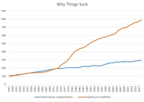
Of course, the devil’s in the details, and our good friends at Seeking Alpha, normally a bullish lot, took the liberty of dismembering the trends and statistics, and have found some trouble right here in River City (and everywhere else, for that matter). For sure, there has been nattering from both the learned and les gens ordinaires about things like “underemployment” and “wage growth”. Indeed, my own earlier column, Why Things Suck, demonstrated that for the last 40+ years, wages in America have not kept up with the cost of living, and the cumulative differential is now huge. In other words, folks are getting jobs, but those jobs really suck.
The folks at Seeking Alpha did something more interesting, though. They looked at cycles and trends, and particularly those relative to the onset of recessions. (Note that I looked at this same trend with respect to the Yield Curve back in late August.) In an article on Thursday titled “Employment: It’s the Trend That Matters”, Lance Roberts did a great job of dismembering the current news into the key and critical trends.
He starts off with giving the devil his due — the seasonally adjusted trend line in employment is sharply upward. However, when you take a peek at some of the underlying issues, you come away with some very different information. Workforce participation stinks, in no small measure due to the fact that over-55 workers are staying in the workforce, to an extent crowding out younger workers. He notes that for many of these older workers, retirement is simply not an option today. Many of these folks will simply have to work until they die.
More to the point, though, the actual rate of change in employment is trending downward, both in the long-term and the short-term. Roberts goes back several decades and finds that the general employment trend in America, as a rate-of-change percentage, is downward.
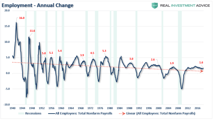
Courtesy Lance Roberts, Real Investment Advice
In short, when you take a simple linear trend over the last 3/4 of a century, back as far as we’ve been keeping good data, the suggestion is that our workforce growth is really declining. This has some broader implications for a maturing economy with a lot of upscale opportunities, a lot of service-oriented jobs, and not much in the middle.
Of more immediate concern, though, the jobs numbers, while positive, are trending in a way that suggests a recession is not far off in the future. Recall in my article about the Yield Curve I noted that this market looked a lot like some other trends we’d seen before. Roberts doubles down on that with employment numbers.

Courtesy Lance Roberts, Real Investment Advice
In the end, Roberts issues an homage to those of us who watch yields more closely than employment, noting that one or the other — yields or employment — will soon break. His question is, which first?
Share this:

Why things suck
OK, there are a lot of things that suck right now, but I’m going to focus on the major malaise in the economy. If unemployment is, as we are told, better than it has been since the time of the Holy Roman Empire, and the stock market is at an all time high, too, then why do we feel so sucky about things? Where’s the beef?
Here’s a bit of the problem. Following WW-2, millions of service members came out of uniform, got blue and white collar jobs, bought houses in the ‘burbs, bought new cars every few years, TVs, all the appliances, occasionally bought new, larger houses, and lived the good life. Middle Class in America was pretty good. Not everyone was there — we had a lot of poverty and racial strife — but still, if you made it to the middle class, you had something pretty good.
Today, though, the middle class seems out of reach for a lot of Americans. Poverty seems to be growing, rather than shrinking, and it is nearly impossible for a single-wage-earning household to make ends meet. Home ownership is increasingly out of reach for young families. Indeed, the proportion of home buyers who are “first time buyers” is unsustainably low.
I took a look at some data from the Bureau of Labor Statistics this morning, dating from 1947 all the way to the present. It’s simple stuff — real hourly wages (that is, hourly wages after accounting for inflation) versus inflation itself. Not surprisingly, real wages have actually gone up. The trend is positive and substantial. People SHOULD be feeling pretty good. As you might suspect, real wages and inflation tracked one another after WW-2. This meant that every year stuff got more expensive, but your income kept up with it. If and as you grew in your job and got promoted, you’d make more money. However, if you kept the same job for your entire career (as many in the middle class did), then at least you’d keep up with inflation.
Data courtesy U.S. Bureau of Labor Statistics
However, all that got broken sometime in the mid-1970’s. Inflation hit the U.S. like a ton of bricks. Real hourly wages continued to rise, year in and year out, but the cost of stuff decimated the purchasing power. This may seem mathematically incongruous, but for those of us who lived in the 1950’s and 60’s, it resonates. Note how two important purchases — housing and cars — have outstripped average incomes since 1960.
 “Today” is a mix of 2017 & 2018 data, as available
So there’s that. Sure, houses are nicer today than in 1960, cars are nicer (and safer, too), and we get a lot better health care today than w-a-a-a-ay back then. However, arguably, the linkage between working and achieving “the good life” seems to be broken today for millions in the middle class. That’s one of the main reasons why things seem to suck today. This has enormous implications as we go into a major mid-term election. However, from an economic perspective, these long term trends are decidedly problematic. This is the global warming of the national economy.
Share this:

Top of the residential market?
Ever wonder where the top of the residential market is? A small part of our practice at Greenfield over the years has been consulting on really top-tier, “trophy” real estate. Valuing these properties is part art, part science, and everyone in that rarified realm is always trying to figure out where the top might be.
It appears that some of the very top of this market is softening, according to an article yesterday on CNBC.com by Robert Frank, their wealth editor. As it happens, tax law changes and a pull-back by foreign investors (particularly from China) means that the very top tier of properties have seen pricing reductions this summer. Indeed, the top 500 homes on the market saw total price reductions of $1 Billion of late.
For example, the Ziff family estate in Florida was previously on the market for $195 million. After two price reductions in a year, it is now down to $138 million, a reduction of over a quarter in its offer price, and still with no takers. Sean Elliott, one of the leading brokers for mansions such as this, notes that there are no comparable transactions to go on. Indeed, often such properties have to test the market first, and then adjust prices accordingly.
The article makes good reading, even if you’re not presently in the market for a $100 million beach house: The $1 billion price cut: Luxury real estate gets slashed.